Thursday, September 25, 2008

Creating the Illusion of Texture


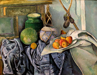
Paul Cezanne uses lots of shadows and highlights in this painting. He uses highlights and mid tones in the fruit and varies the brush strokes on the pears to show the smoothness and bring out its round shape. My eyes are brought straight to the pears because of their warm bright hues of orange. Cezanne effectively uses contrast and shadows and value in the tapestry because it is clear to see all the folds and curves in the cloth it' s as if you could just put your fingers on the cloth and feel its softness and the folds. The side of the painting that contains the tapestry is dark in comparison to the fruit on the white cloth. it creates interest. The vases and jars look smooth and glassy. He mixes up the edges on one of the vases to give it a bumpy criss-cross feeling and pattern that you could touch.

Tuesday, September 23, 2008

Studies in Smallness Paintings and Reflection


These are my two finished paintings. I struggled with making shadows and highlights because I got mixed up with combining complements of the object's color and the paper's color. At times I could not effectively create the shadow or highlight I wanted. However, I am happy with my pepper painting because I was able to incorporate the highlights and shadows well and make the pepper look 3D and realistic.


Thursday, September 18, 2008

Composition as a Tool


In the painting Still Life with Three Puppies by Paul Gaughin, Paul Gaughin uses grouping and repetition, and color to make a great painting. He repeats the theme of three puppies, three green cups, and a group of pears. He uses bright radiant colors and a range of hues of yellow and green. He aslo creates balnce through the position and placement of the puppies and the cups and fruit- the cups immediately draw my eye in. The color and attention is in the foreground and the puppies are in the bckground.

Wednesday, September 10, 2008

Paintings I Remember

This summer I went to the National Young Leaders Conference in Washington, DC. While I was there, I visited the Smithsonian Museum and saw many types of paintings. There were various paintings of landscapes and people. One painting in particular that I remember is an oil painting of a landscape with a beautiful waterfall and green trees and brush that encompassed the water. I remember this painting because it was very detailed and I loved the scenery. Plus, I could see the tiny brushstrokes and all the hard work that went into making the painting.

Morandi vs. Van Gogh; Color

Giorgi Morandi makes paintings of bottles using unsaturated colors. Van Gogh on the other hand makes paintings of flowers using vibrant saturated colors. Morandi's paintings consist of man made objects, where as Van Gogh's paintings deal with nature.


Van Gogh really cares about preserving nature. He makes people aware of what happens to flowers when they are kept inside; they begin to wilt and die. On the contrary, Morandi focuses on the forms of bottles. It isn't really clear what he wants people to take away from his paintings.

Color Mixing Chart


Tuesday, September 9, 2008

My Skills as an Artist

I can make good paintings using the principles of design. I know how to show texture and make things look realistic in my paintings. I am also good at painting landscapes and showing lots of details.

The major things I struggle with are charcoal drawings and making shadows.

What I Know Now

The primary colors are red, yellow, and blue.
Some secondary colors are orange, green, and purple.These secondary colors are created by mixing two primary colors together.
Complimentary colors are colors that are opposite primary colors on the color wheel. For example, purple is a compliment of yellow. Green is a compliment of red.

To emphasize something in a painting, you could use some of the Art Principles of Design. You could use contrast, balance, symmetry, repetition, or continuation of objects in a painting.

If I was trying to create a shadow on an object in a painting, I would use contrast. I would use the complimentary color of the object to make the shadow seen. To make a highlight I would use a lighter or darker color of the object.

I would use a cool color such as blue for the background to make the object look like it was far away.

I would plan and make different sketches of how I wanted the painting to look like.

Why I'm taking Oil Painting

I signed up for this course because I wanted to learn about oil painting. I saw some students while they were oil painting, and it looked cool. I love painting in general.

Plus, the rest of my classes are very intense, so I wanted a class where I could relax a little.